DATE DELIVERED 31/08/20202
PRINCIPLES OF ARTS /DESIGN
DEFINITIONs: The principles of art (or the principles of design) are essentially a set of criteria which are used to explain how the elements are arranged in a work of art. OR
The principles of art represent how the artist uses the elements of art to create an effect and to help convey the artist’s intent. The principles of art and design are balance, , emphasis ,rhythm, and unity /harmony, variety. The use of these principles can help determine whether a painting is successful, and whether or not the painting is finished.
These principles are possibly the closest thing we have to a set of objective criteria for analyzing and judging art.
The following is an explanation of what the principles of art are and how you can use them to benefit your own artworks.
Balance
Balance is concerned with the visual distribution or weight of the elements in a work of art. A painting could be balanced if one half is of the same visual weight as the other half. Or, you could have a small area of heightened significance which is balanced against a much larger area of less significance, like in the painting below. In the painting below, notice how the dark areas used for the boat and foreground appear balanced against the much larger area of soft, tinted colors. Balance can be achieved in 3 different ways:
- Symmetry, in which both sides of a composition have the same elements in the same position, as in a mirror-image, or the two sides of a face.
- Asymmetry, in which the composition is balanced due to the contrast of any of the elements of art. For example, a large circle on one side of a composition might be balanced by a small square on the other side
- Radial symmetry, in which elements are equally spaced around a central point, as in the spokes coming out of the hub of a bicycle tire.
Proportion
Proportion concerns the relationship between the sizes of different parts in an artwork. For example, the width compared to the length, the area of the sky compared to the land or the area of foreground compared to the background.
Variety
Variety refers to the use of differing qualities or instances of the visual elements. Variety can be used to break up monotonous or repetitive areas.
Harmony and Unity
Harmony is a bit vague compared to some of the other principles. Generally speaking, it refers to how well all the visual elements work together in a work of art. Elements which are in harmony should have some kind of logical progression or relationship. If there is an element which is not in harmony with the rest of an artwork, it should stick-out and be jarring to look at. Kind of like an off-note in a song.
Emphasis/ Dominant
Is when the artist creates an area of the composition that is visually dominant and commands the viewer’s attention. This is often achieved by contrast.
Rhythm
Is created by movement implied through the repetition of elements of art in a non-uniform but organized way. It is related to rhythm in music. Unlike pattern, which demands consistency, rhythm relies on variety.
QUESTION
1:Mention the principles of arts and desig
2: Explain all the principles
DATE DELIVERED: 17/08/2020
ELEMENTS OF ART/DESIGN
INTRODUCTION
In order to understand any field, it’s important to have a solid foundation from which to grow. For visual art, this means understanding the elements of art. These creative building blocks are essential and having a grasp on how they work is important both for artists and for lovers of art. By gaining a deeper understanding of the elements of art, it’s easier to analyze, unravel, and create any type of artwork from painting and photography to sculpture and architecture.
In fact, many of these elements are taught to schoolchildren as part of basic art education. But while the concepts may seem simple, once mastered they can stretch and grow in all directions, no matter what style of art is being created or appreciated.
DEFINTION: The elements of art are concrete visual components that work in tandem with principals of art that organize and harmonize them.
THE ELEMENTS: Line, color, shape, form, value, space, and texture are the seven core elements of art and they often overlap and inform one another. Whether talking about drawing, painting, sculpture, or design, these components of art all need to be taken into consideration. Once you have a handle on these seven visual elements, it’s even easier to create your own art.
But you don’t need to be an artist yourself to find the elements of art useful. Any art lover will be able to view artwork in a more meaningful way by learning more about these core visual components.
What are the seven elements of art?
LINE
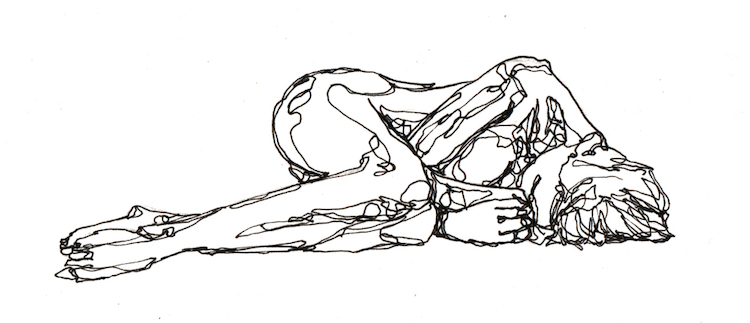
These marks span a distance between two points and can be straight or curved. In visual art, lines don’t only need to be made with marks and outlines. They can also be implied or abstract. Whether two-dimensional or three-dimensional, there’s no denying that lines have a huge impact on the rest of the elements of art. They can be used to create shape and form, as well as give a sense of depth and structure. Lines are the foundation of drawing and are a powerful tool unto themselves. Using different types of lines—continuous, broken, vertical, jagged, horizontal—drastically changes the psychology of an artwork, impacting the viewer greatly.
COLOR
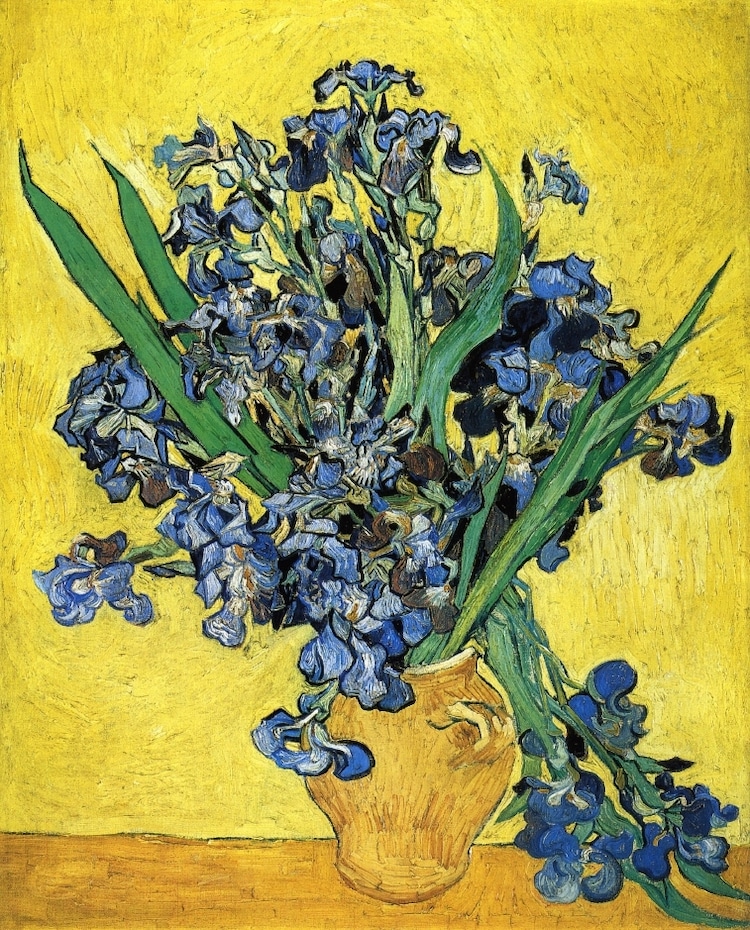
“Still Life with Irises” by Vincent Van Gogh. 1890.
By working with hue, value, and intensity—three building blocks of colors—artists can tap into a wide range of emotions. There’s nothing that changes an artwork’s emotional impact more than color. Masters like Van Gogh, Monet, and Toulouse-Lautrec all expertly manipulated color in their art to provoke different feelings. Color can be used symbolically or to create a pattern. It can be selected for contrast or to set a specific mood. A deep understanding of color theory helps any artist make better use of the colors they have at their disposal.
SHAPE
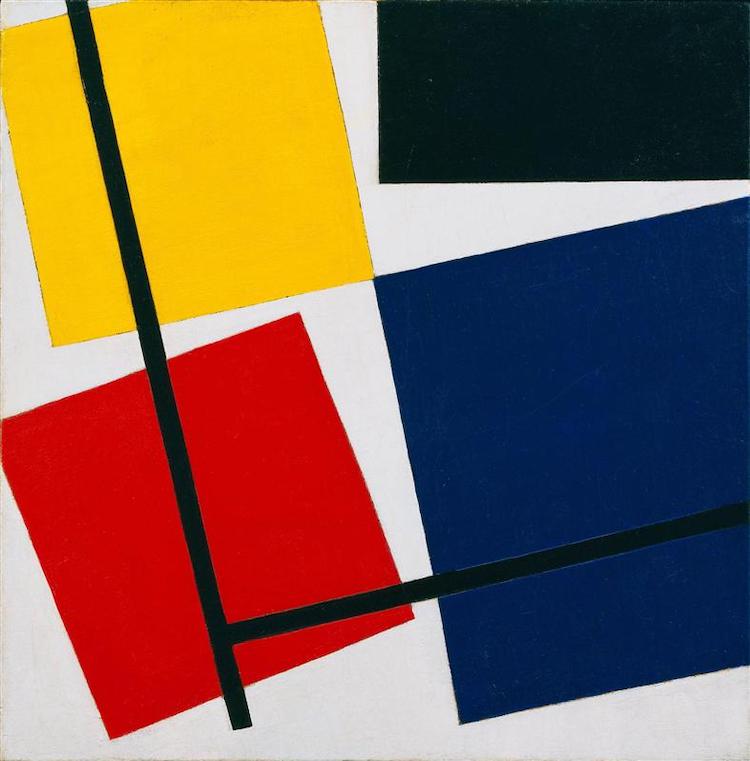
“Simultaneous Counter Composition” (1930) by Theo van Doesburg (Photo: Public domain via WikiArt)https://967a6e976349015208719aed792cebf3.safeframe.googlesyndication.com/safeframe/1-0-37/html/container.html
The result of closed lines, shapes are two-dimensional, flat, and only have height and width. Geometric shapes like circles and squares are mathematical and precise, while organic shapes take cues from nature and tend to be curved and abstract. Henri Matisse‘s collage art makes great use of organic shapes, while Piet Mondrian is known for relying on geometric shapes in his paintings. Shapes can be used to control how we perceive a composition. For instance, triangles can help draw the eye to a particular point, while circles represent continuity.
FORM
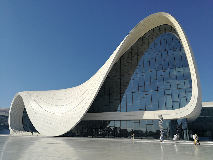
When a shape acquires depth and becomes three-dimensional, then it takes on form. Cylinders, pyramids, and spheres are some of the more common forms, though they can also be amorphous. In sculpture, form is of the utmost importance, though it can easily be introduced into drawing and painting using 3D art techniques. Baroque sculptor Bernini was a master of form, carving his sculptures in a way that gave enjoyment from any perspective. Form is also a big consideration in architecture, with acclaimed architects like Frank Lloyd-Wright, Zaha Hadid, and Tadao Ando giving careful consideration to this element in their designs.
VALUE

“The Tetons and the Snake River” (1942) by Ansel Adams. (Photo: Public domain, via Wikimedia Commons)
Related to color, value is the lightness and darkness of a color. The lightest value is white and the darkest value is black, with the difference between them defined as the contrast. Playing with value can not only change certain forms, but also influence the mood of the artwork. Value is so important that the Italians created a term—chiaroscuro—that specifically refers to the use of light and dark in a piece of art. Baroque painter Caravaggio was a master of using chiaroscuro in his moody oil paintings. Photographer Ansel Adams is another example of an artist who expertly used value to his advantage by using areas of contrast to create interest in his landscape photography.
SPACE

(Photo: Guillaume Briard)
This element of art can be manipulated based on how an artist places lines, shapes, forms, and color. The placement of these other elements creates space. Space can be either positive or negative. Positive space is an area occupied by an object or form, while negative space is an area that runs between, through, around, or within objects. Artists often think about the foreground, middle ground, and background of their artwork, purposefully placing shapes and lines throughout the space to achieve the perfect composition. A sense of depth in two-dimensional works is often achieved by perspective, which itself can rely on lines or colors.
TEXTURE
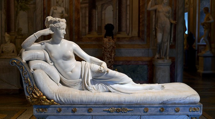
“Pauline Bonaparte as Venus Victrix” (1805-1808) by Antonio Canova. (Photo: Public domain via Wikipedia)
Texture is an element of art that also plays to our sense of touch. It’s defined as a description of the way something feels or looks like it would feel. Sometimes we’re speaking about an actual texture that can be felt, as in the case of Icelandic artist Hrafnhildur Arnardóttir, who creates installation art using synthetic hair. Other times, the texture is an implied visual texture that is two-dimensional. Smooth, rough, hard, soft, furry, fluffy, and bumpy are just some different textures that evoke different responses.
For instance, an artist look for a hyperrealistic result would want clouds to appear fluffy, while another artist wishing to subvert conventions might play with texture to create a surreal experience for the viewer. 19th-century sculptor Antonio Canova was a master of this, as exemplified by his portrait of Napoleon’s sister where she’s resting on a cushion that seems so soft and touchable, it’s hard to believe that it’s marble.
QUESTION
List any five elements of design and explain them
DATE DELIVERED :10/08/2020
UNITY
Unity: is a state of people being in agreement and acting together for a particular purpose.
Unity makes people to come together, work together and to have a team spirit in achieving an objective. There is peace and harmony when people unite.
IMPORTANCE OF UNITY
1 Unity is needed for survival
As we all know unity protects us from all the evil doings, hence we people should help each other and together we should fight and face the evil and negative things, when we together stand only then we get freedom from all kind of negativity. Example, at the workplace you can easily survive when your team support you, your survival becomes easy even in the case of animals survival needs unity for example bat helps each other by sharing their food(blood) so that when they don’t have food they can get help from each other and can survive longer
.2. Unity helps to grow
Nothing can grow alone, if you want to grow your business you want team members employees, if you want to grow your family you need your partner, if you want to achieve something huge in your life you need to walk together, as it says if you want to grow and want to go far then you need to move together.
3. Unity works in wonders
Unity gives freedom, unity makes us win, we all can work, we all have the capability to start business but by working together we can win, individually we are like one drop but together in unity we are like ocean, in this world you will meet different people, and every different people will know something that you don’t hence by understanding each other we people can learn through each other.
As it says “ I CAN DO SOMETHING WHICH YOU CANNOT, AND YOU CAN DO SOMETHING WE I CAN’T BUT TOGETHER WE CAN DO GREAT THINGS.”
4. Unity gives courage
Whenever you see injustice, you feel like saying but at the same moment you get afraid, but at the same moment when you get support you become brave and stand towards that injustice and face it, you get that courage because you knew that you have people who stand behind you and support you against that injustice, hence in order to deal with any injustice we people should fight together only then we can see the change.
In this world everyone wants change, but no one wants to become that change, no one wants to stand first, everyone wants others to do something about it, but friends this is our country our home and we all must take initiative to do something, hence instead of thinking about the change, be that change and help each other support each other and be kind. We people should always stand together because unity not only gives us power strength courage but it is also needed and very much important for our survival.
QUESTION
Explain briefly how unity promote courage.
DATE DELIVERED: 3/08/2020
GOVERNMENT AGENCIES THAT FIGHT THE PRODUCTION AND DISTRIBUTION OF FAKE AND ADULTERATED GOODS
- NAFDAC: National Agency For Food and Drug Administration and Control
- NAFDAC is the National Agency that monitors and control the standardization on food and drug products. Regulate and control the importation, exportation, manufacture, advertisement, distribution, sale and use of drugs, cosmetics, medical devices, packaged water and chemicals
- Conduct appropriate tests and ensure compliance with standard specifications designated and approved by the council for the effective control of quality of food, drugs, cosmetics, medical devices, packaged water, and chemicals.
- Undertake appropriate investigation into the production premises and raw materials for food, drugs, cosmetics, medical devices, bottled water and chemicals and establish a relevant quality assurance system, including certification of the production sites and of the regulated products
- Undertake inspection of imported foods, drugs, cosmetics, medical devices, bottled water, and chemicals and establish a relevant quality assurance system, including certification of the production sites and of the regulated products.
- Compile standard specifications, regulations, and guidelines for the production, importation, exportation, sale and distribution of food, drugs, cosmetics, medical devices, bottled water, and chemicals
- Undertake the registration of food, drugs, medical devices, bottled water and chemicals
- Control the exportation and issue quality certification of food, drugs, medical devices, bottled water and chemicals intended for export
- Establish and maintain relevant laboratories or other institutions in strategic areas of Nigeria as may be necessary for the performance of its functions.
2. NDLEA: National Drug Law Enforcement Agency
- Investigate and prosecute criminals.
- Patrol public places, where the drugs might be illegally exported abroad.
- Consolidate with international agencies to fight drug traffickers.
- Demolish narcotic plants, substances, and drugs they find.
- Prevent manufacturing and selling of drugs.
Standards Organisation of Nigeria (SON),
This is the policy-making body for supervising the administration and financial management of SON.
The Council is responsible for among other things:
- ● Establishing and compiling Industrial standards in Nigeria.
- ● Compiling an inventory of products that require standardization.
- ● To provide reference standards for verification and calibration of measurements, and equipment used for measuring in Nigeria.
- ● To carry out inspections of the quality of products and materials, and facilities used in production. Also, to institute a quality assurance system which includes the certifying of products, laboratories, and factories.
- ● To carry tests and make sure every product and service comply with the standards approved by the council.
- ● They also develop the methods for testing of equipment, materials, and supplies including the ones purchased for the government use.
QUESTIONS
- Write out the full meaning of the following agencies
a. NDLEA
b. NAFDAC
c. SON
2. State two functions of SON
DATE DELIVERED :27/07 /2020
FAKE AND ADULTERATED GOODS
Fake goods are goods that are produced to imitate genuine and authentic goods. They are produced to deceive and defraud buyers.
Adulterated goods are goods that are made impure by adding inferior materials and re-processing them. Materials that are cheap and less of quality are used to adulterate good products during the addition or reproduction. The goods that are made impure through this process are called adulterated goods.
GOODS OFTEN FAKED AND ADULTERATED
- MEDICINE
- PROCESSED FOOD
- CLOTHING
- FABRIC
- WINE
- OLIVE OIL
- HONEY and more.
REASONS WHY PEOPLE PRODUCE AND DISTRIBUTE FAKE AND ADULTERATED GOODS
1 Corruption, greed and conflict of interest
Corrupt practices among law enforcement personnel and the involvement of some greedy high ranking government officials in the manufacture and distribution of fake drugs has to a great extent affected the efficiency of Drug Regulatory Agencies (DRAs) in checkmating the manufacture and distribution of fake drug products. This has made it difficult for DRAs to arrest, prosecute or sanction culprits..
2. Inefficient cooperation between drug regulatory authorities and stakeholders
Ineffective cooperation existing between the drug regulatory authorities and other stakeholders like the judiciary, police and custom officials oftentimes delay arrests, judgments and sanctioning of culprits. This makes the control of drug markets and enforcement of drug laws very difficult.
3.Lack of patriotism
The lack of love for the country causes people to produce fake and adulterated goods. A patriotic citizen support and defends his country, he remains loyal to his homeland and refuses to adulterate pure and valuable goods.
4. High cost of quality drug products
When prices of drug products are high and there are significant price differentials between genuine and fake products, counterfeiting may be encouraged (as large profit can be generated from the manufacture and supply cheap counterfeit drug products to consumers who most of the time cannot afford the high priced quality drug products from reputable sources).
5. Ignorance and increase in self-medication culture
Ignorance, as a factor contributing to availability of fake drugs can be attributed to the literacy level of a given population. This is because it will be difficult for such people to differentiate genuine drug products from fake as they are easily enticed by the cheaper prices and easier accessibility from patronizing drug vendors. Some individuals still prefer to self-medicate when they are ill. They end up patronizing unlicensed drug vendors without bothering if the product is genuine or not.
How to identify fake goods/products.
This can be extremely difficult, but where you can:1. Buy from vendors and supermarkets who have a reputation for testing products and follow good labeling practices
2. Buy whole products, such as pepper corns and coffee beans, and grind them yourself
3. Ensure the name and address/contact details of the manufacturer is indicated on the packet and also look for recycling symbols and trademarks
4. Look for spelling errors in the description on the packet and also check the quality of the images or if the ink has run on the printing5. Be suspicious of labels that aren’t affixed neatly or don’t reflect the product in the packaging.
QUESTIONS
1.Briefly explain fake and adulterated goods
2.State two way on how to spot fake goods.
DATE DELIVERED:20/7/2020
SENSE OF BELONGING
DEFINITION:
A feeling of acceptance of, valuing, being a member of, and sometimes even ownership of a particular place or object. OR
The feeling of fitting in with other students in the college as well as not feeling out of place there based on societal expectations or expectation of college personnel.
HOW TO ACHIEVE SENSE OF BELONGING AT SCHOOL
1. Establishing good relationship
2. Peer group, ie joining a group that brings positive development that will help.
3. Behaviour, personal thought and reactions toward situation.
4. Avoid solitary life.
5. Volunteer for a cause you are interested in
s. OTHER MEANS ARE:
- Feel proud of their school
- Feel useful there
- Have a positive relationship with school staff
- Join activities during the school day and after school
- Feel they belong to the group and take on the group’s values
- Feel comfortable communicating with others
- Be relaxed in group situations
- Show sensitivity and cooperativeness
- Think of and suggest ideas the group can use
- Take on responsibilities
Good to know: These are a few signs that suggest a child has a strong sense of belonging.
- Have a good relationship with the staff at school.
- Take part in activities organized by the school.
- Read the school’s code of conduct and information memo
QUESTIONS
- What is sense of belonging ?
- State four ways of achieving sense of belonging.
DATE :13/7/2020
TEAMWORK
DEFINING A TEAM:A team is a group of people who collaborate on related tasks toward a common goal.
Teams have defined membership (which can be either large or small) and a set of activities to take part in. People on a team collaborate on sets of related tasks that are required to achieve an objective. Each member is responsible for contributing to the team, but the group as a whole is responsible for the team’s success.
TEAMWORK: Teamwork involves a set of interdependent activities performed by individuals who collaborate toward a common goal.
Teamwork involves a set of tasks and activities performed by individuals who collaborate with each other to achieve a common objective. That objective can be creating a product, delivering a service, writing a report, or making a decision. Teamwork differs from individual work in that it involves shared responsibility for a final outcome
CHARACTERISTICS OF EFFECTIVE TEAMWORK
Effective teamwork requires certain conditions to be in place that will increase the likelihood that each member’s contributions—and the effort of the group as a whole—will lead to success. Effective teams share five characteristics:
- Shared values: a common set of beliefs and principles about how and why the team members will work together
- Mutual trust: confidence between team members that each puts the best interest of the team ahead of individual priorities
- Inspiring vision: a clear direction that motivates commitment to a collective effort
- Skill/talent: the combined abilities and expertise to accomplish the required tasks and work productively with others
- Rewards: recognition of achievement toward objectives and reinforcement of behavior that supports the team’s work.
IMPORTANCE OF TEAMWORK
The benefits of teamwork include increased efficiency, the ability to focus different minds on the same problem, and mutual support.
- . Higher efficiency: Since teams combine the efforts of individuals, they can accomplish more than an individual working alone.
- Faster speed: Because teams draw on the efforts of many contributors, they can often complete tasks and activities in less time.
- More thoughtful ideas: Each person who works on a problem or set of tasks may bring different information and knowledge to bear, which can result in solutions and approaches an individual would not have identified.
- Greater effectiveness: When people coordinate their efforts, they can divide up roles and tasks to more thoroughly address an issue. For example, in hospital settings teamwork has been found to increase patient safety more than when only individual efforts are made to avoid mishaps.
- . Mutual support: Because team members can rely on other people with shared goals, they can receive assistance and encouragement as they work on tasks. Such support can encourage people to achieve goals they may not have had the confidence to have reached on their own.
- Greater sense of accomplishment: When members of a team collaborate and take collective responsibility for outcomes, they can feel a greater sense of accomplishment when they achieve a goal they could not have achieved if they had worked by themselves.
Teamwork leads to learning
- Every individual has his own set of skills and strengths. When the whole team works as one unit, people can always avail opportunities to learn from others. This process leads to resource building as employees then become better equipped to deal with challenges
QUESTIONS
- Define Teamwork
- Explain briefly how to achieve a set goal under the following importance:
- Greater sense of accomplishment.
- More thoughtful ideal.
- Fast outcome.
DATE DELIVERED 6/7/2020
BATIK
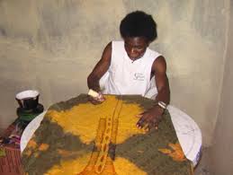
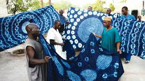
DEFINING BATIK : Batik is a resist dyeing technique for making designs on fabric, similar to tie-dyeing and shibori dyeing. Wax is used on fabric to prevent dye from penetrating the cloth. Wax is applied, followed by dye, to create complex designs on fabric
BATIK :Is an Indonesian technique of wax-resist dyeing applied to whole cloth. This technique originated from Java, Indonesia.Batik is made either by drawing dots and lines of the resist with a spouted tool called a tjanting, or by printing the resist with a copper stamp called a cap. The applied wax resists dyes and therefore allows the artisan to colour selectively by soaking the cloth in one colour, removing the wax with boiling water, and repeating if multiple colours are desired
Dyeing Techniques
Dyeing is the process of adding color to textile products like fibers, yarns, and fabrics. Dyes are obtained from flowers, nuts, berries and other forms of vegetables and plants as well as from animal and mineral sources. These are known as natural dyes. The other class of dyes is known as synthetic dyes. These are based on a particular type of chemical composition.
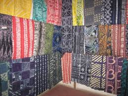
The method is used mainly on cottons and in the traditional colours of blue, brown, and red. Multicoloured and blended effects are obtained by repeating the dyeing process several times, with the initial pattern of wax boiled off and another design applied before redyeing. The basic technique, originated at an unknown time, was apparently practiced widely in Southeast Asia with local variations, as in Celebes Island, where the wax was applied with bamboo strips.
Tools and Materials
- Pencil and Paper
- Muslin( lightweight cotton cloth in a plain weave).
- Scissors (fabric scissors, if you have them)
- Newspaper
- Drop Coth, Tarp, or Plastic Sheet
- Fabric Dyes
- Containers with Lids for the Dyes
- Water
- Beeswax (you can buy specific batik wax)
- Crock Pot or Hot Plate and Pot (to melt the wax)
- Tjanting Needles
- Paintbrushes for Dye
- Latex-Free Rubber Gloves (optional)
- Large Paintbrush for Hot Wax
- Clothes Iron
PROCEDURE
Cut Fabric and Draw
Cut pieces of muslin to size. I’ve found that 9″ x 12″ is a good size for a first project. Have students tape the fabric to a board or place it on a table or work area. Then, have students draw their designs directly onto the muslin with pencil. Alternately, they can place a sketch under the muslin and trace it onto the fabric. The sketches should be as light as possible so the pencil lines do not show through on the final product. I generally give my students their choice of subject matter, but simple landscapes and animals always work well. Encourage students to avoid including too many small details.
3. Apply the First Layer of Wax
Students will use the tjanting needles to “draw” with liquid wax directly on the muslin. Be aware there are different sizes for different levels of detail.
The wax provides a resist, and anything that is covered with it will end up white in the final piece. You may want to provide students with scrap muslin to practice on, as the tjanting needles take some getting used to. Once ready, students can begin on their final pieces. After they have gone over all of their pencil lines, extra drips, dots, and lines of wax can be added for visual interest.
I have my wax in a small pot on a hot plate, but there are safer and better options. An old crock pot works well–it doesn’t get too hot, and the chance of spilling is minimal.
If you’re looking for even more advanced fibers techniques to bring into your classroom, you’ll want to check out AOE’s course, Studio: Fibers. You’ll learn about 2D and 3D weaving, embroidery, felting, and more. As with all of our Studio courses, you’ll push your personal practice to the next level while revamping your curriculum.
4. Add the Dye
After the first wax layer is complete, it’s time to add the dye. Although much traditional batik is placed in a dye bath, you can also use paintbrushes to place color in a specific and detailed way. Painting with the dye is similar to painting with watercolor. However, the muslin does absorb the dye very quickly, so you may want to have your students practice a bit here too. Once they get the hang of it, they’ll enjoy layering and mixing colors.
I recommend Dylon Cold Fabric Dyes. They are easy to mix (hot water and a whisk), stay good for a long period of time, and are vibrant and intense.
After mixing according to packet directions, store dyes in well-labeled, covered containers to avoid evaporation. I cut out the labels from the dye packets and label both the containers and the lids.
5. Apply the Second Layer of Wax
After the dye is dry, it’s time for the second layer of wax. This time, it is painted over the entire piece of dyed muslin, on both the front and the back. Two coats work best, but you can often get away with one. I recommend having just one brush dedicated to this job. I like a three-inch brush that can cover large areas quickly.
This layer of wax creates a seal over the entire piece, which will be cracked and broken to allow a crackle effect in selected areas.
6. Complete the Crackle Effect
After the second layer of wax has hardened and cooled, you can begin to work on the crackle effect. Have students bend and fold the fabric to cause the wax to crack and break. This will allow the black dye to penetrate the wax seal in those specific, cracked areas.
If you are feeling adventurous, you can hand out latex-free rubber gloves and have students dip their entire pieces into a bucket of black dye. This completes the job quickly, but it will find EVERY imperfection in the wax seal. Students may end up with more black on their pieces than they want.
For more precision, simply have students use a brush to paint or dab the black dye over the cracks. This takes longer but allows a greater measure of control over the amount and placement of the black dye and the crackle effect.
7. Remove Wax
Removing the wax is simple, but time-consuming. You need to iron, iron, iron…and then iron some more. Have students place the batik in between layers of newspaper, then iron over the piece, allowing the newspaper to absorb the liquid wax as it heats up. Once the newspaper is completely saturated, switch it out for fresh newspaper. It will take numerous repeats to remove all of the wax from the fabric. Once you have removed it all, the piece is finished.
8. Enjoy the Finished Piece!
Finished pieces can be mounted to a variety of surfaces including cardboard, matboard, and illustration board. To do so, stretch the fabric over the board and glue the edges to the back. However, many students love to take the fabric home with them as it is, without mounting. They love the tactile quality and the novelty of having a completed artwork on fabric.
QUESTION
State the procedure of producing batik
DATE DELIVERED: 29/06/2020
THE NIGERIAN TRADITIONAL ARTS
INTRODUCTION: Nigeria is blessed with many tribes, languages, dialect, and different cultures that are very rich. Those cultures reflected in the art of these different people or ethnic groups. Nigerian is one of the Africa countries that had been in the forefront in making impact in the arts of the entire African continent. Nigeria arts are expressed in various forms-stylized, naturalistic and symbolic. Such symbols like the ancestral spirits and diseases are common in the traditional Nigerian artworks. Before the advent of the European, the likes of Nok, Ife, Benin cultures are known to the historians mainly because of the objects found in the these areas(Nok villages, Ife town and Benin town). All these traditional arts will be further discussed under the following sub-headings: location, date, medium/ media, historical background/ discovery, characteristics and examples.
THE NOK CULTURE
Location: The nok arts is located within the sub Saharan area such as Wamba, Jemma, Kagoro and old Abuja in Kaduna very close to Jos. It was an historian in person of Bernard Fagg who named the art works after the village NOK. Nok represents the oldest of the sculpture tradition in Nigeria andAfrica.
Date: The Nok culture has been dated back conservatively between 500BC and 300 B.C.
Medium: The Nok culture was produced in terracotta (i.e a fired clay that turns brownish in colour ).
Size: The size ranges from 10cm and 1.5meters.
Historical background/ discovery: There are two schools of taught concerning the discovery of Nok arts, first and foremost Nok art was discovered by an historian in person of Bernard Fagg from British museum in 1952. Also, it was discovered by col.Dent Young in 1928.The Nok culture is in form of animals and human, example, the type of elephant image and human being.
Characteristics:
- Nok art is semi-naturalistic in nature.
- The eyes are triangular in shape, and pierced.
- The nostrils are made with holes.
- The mouths are opened.
- The Nok arts has elaborate hairdo
- Possession of crown shaped head
- Cylindrical, oval in shape.
IFE CULTURE
Ife is believed to be the cradle of Yoruba civilization, and it shows its manifestation of naturalism.
Location: Ife art is located within the ife town such as Iwinrin grove, Obalufon, Lafogido,Wumonije’s compound, south western part of Nigeria.
Date: Ifeart was dated around 1100 and 1400 AD
Medium: Ife art is produce in different media such as terracotta, bronze, stone and brass.
Size: The size is life size.
Historical background / discovery:Ife art was firstly discovered by Richard and John Lander in 1832,when the glass beads were produced. It was later discovered by an archaeologist in person of Leo Frobenius in the year 1910. Also,years later,Ife art was discovered in Wumonije’s compound while he was digging the foundation of his house.
Examples of Ife arts: Ife terracotta head, terracotta elephant head, olokun bronze head, king and queen bronze work, obalufon mask, Ooni Lafogido bronze figure and bronze bowl figure of a queen.
Characteristics:
- It is naturalistic in nature (i.e. realistic).
- The eyes are fixed into the sockets.
- There is the presence of scarifications ( i e facial mask).
- Ife arts are heavily beaded with necklaces, bracelet and anklets.
- There is presence of holes representing the hair around the mustache and on the fore-head.
- The faces wear that of the noble people.
QUESTION S: 1 – Explain briefly the Nok culture under the following sub –heading;
- Location,
- Dating,
- Historical background,
- Three characteristics.
2- List the media for the production of both Nok and Ife arts.
DATE DELIVERED: 22/6 2020
PERSPECTIVE
PERSPECTIVE: is an art technique for creating an illusion of three-dimensions (depth and space) on a two-dimensional (flat) surface. Perspective is what makes a painting seem to have form, distance, and look “real.” The same rules of perspective apply to all subjects, whether it’s a landscape, seascape, still life, interior scene, portrait, or figure painting.
PRINCIPLES OF ACHIEVING PERSPCTIVE
The principle involved is that the objects near the artist of the observer are big whereas those of the same size far away from him are smaller. The principles are of three types which are as follow:
1. When two parallel lines are drawn indefinitely, the lines tend to converge at a point known as vanishing point
2. The object above the horizon come down to meet it. The object below the horizon are drawn to come up to meet it
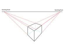
3. Equal distance between two objects looks smaller as the distance increases.
TYPES OF PERSPECTIVE
Perspective is categorized into two major parts namely: LINEAR perspective, AERIAL/ COLOUR/ATMOSPHERIC perspective.
LINEAR PERSPECTIVE: As its name suggests, its deals with the object on a straight line that appears smaller as the distance increases, and appear bigger to the observer when it is closer to an observer. Example,railway track. Linear perspective is of two types which are parallel perspective and angular perspective.
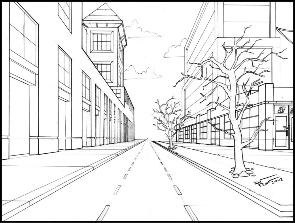

Parallel perspective: The horizontal lines moves toward the eyes level but they do not slope as is the case with angular perspective. The horizontal lines moves towards the eyes level in such a way that the farther they are away from the artist, the closer together they become and tend to meet each other at the horizon.
Angular perspective: In angular perspective all horizontal lines not parallel with the eyes level line slope toward the eyes level and meet the vanishing point or center of vision. This can be achieved through an angle found at the center.
Aerial or Atmospheric Perspective
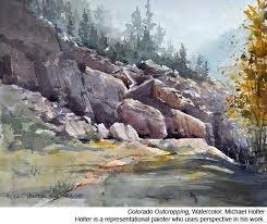
Aerial or atmospheric perspective What is atmospheric perspective? Like linear perspective, atmospheric perspective (sometimes referred to as aerial perspective) also creates the illusion of depth on a two-dimensional surface. But instead of using horizon lines and vanishing points, atmospheric perspective primarily uses color. The term was first coined by da Vinci, who observed in his Treatise on Painting that colors “become weaker in proportion to their distance from the person who is looking at them.” In other words, objects that are further away have blurry edges and appear lighter in color. One master of atmospheric perspective was William Turner, who boldly incorporated it in his landscape paintings. Atmospheric perspective was also mastered by Chinese landscape painters in the 8th century and onward. can be demonstrated by a mountain range in which the mountains in the distance appear lighter in value and a bit cooler, or bluer, in hue. Because of the increased layers of atmosphere between the viewer and objects in the distance, objects that are farther away also appear to have softer edges and fewer details. Artists replicate this optical phenomenon on paper or canvas to create the sense of distance in a painting.
QUESTIONS
1. Explain briefly what perspective is all about.
2. Mention the types of perspective.
Date delivered: 15/6/2020
CONSTRUCTION OF LETTERS
Block lettering is a general term used in describing all lettering styles that are drawn or constructed. . They are constructed according to specifications using squares or blocks. All letters with the exception of “M”, “W” and “I” take 5 squares down and 3 squares across. However, letters “W” and “M” take 5 down, 5 across. On the other hand, letter “I” take 5 squares down and 1 square across.
There is need to have drawing instrument like t-square,ruler, compass, pencil,etc. There are different ways of constructing letters,these include :griding method,construction by measurement and freehand lettering
Procedure:
1.Measure your space -5inches horizontally.
2.Measure your space -5inches vertically.
3.It will produce squares.
4. Pick up your ruler and start constructing within 3holes horizontally and 5 holes vertically.
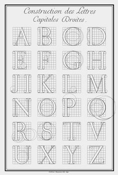
. They are constructed according to specifications using squares or blocks. All letters with the exception of “M”, “W” and “I” take 5 squares down and 3 squares across. However, letters “W” and “M” take 5 down, 5 across. On the other hand, letter “I” take 5 squares down and 1 square across.
Block letters have several characteristics that make them different from other styles of lettering. Some of its distinctive features are outlined below.
1. They have an equal or uniform thickness of strokes. That is all the parts of each of its letters are the same measurement. For instance, if the vertical stroke measures 2cm, the horizontal and circular parts of the letter also measures 2cm.
2. They have no serifs or finishing strokes. There are no ornamental projections at the ends of their letters.
3. All the letters stand erect in a vertical position. They do not slant but stands straight.
4. They are not written but are drawn or constructed.
5. Squares of equal sizes serve as aids in their construction.
6. They are bold and easy to read.
The style has been used for various purposes due to its distinct features. Some of these are listed below.
1. They are used in writing on signboards, billboards, and signposts because of its keen sense of legibility.
2. Block letters are used in writing the titles of books and magazines due to its simple form that readily attracts viewers.
3. They are used in writing the text on greeting cards like birthday cards, success cards, funeral cards etc.
4. They are used in writing names of shops, institutions, and companies because it is easy to read.
5. They are the most widely used style of text for the designing of communication design products such as posters, banners etc.
The construction is not a very painstaking task. As already discussed, constructing block letters involve the use of accurately measured squares on paper. If this is available, the artist has to follow the rules and guidelines that govern the construction of block letters.
Also, the artist has to use a pointed sharp pencil in the ruling of the squares and in the construction of the letters. All the measurements should be done accurately. It is advisable to use straight measuring instruments such as rulers to ensure precision and accuracy.
The curvy parts of the letters can be created using any suitable circular object such as the edges of coins or protractors.
It should be noted that the squares which serve as guides for the construction of the letters should be created with a lighter grade pencil (HB or HH). The marks should be faintly created so that they could be easily erased after the construction of the letters.
QUESTION
What are the procedures for constructing block letters?
DATE DELIVERED: 08/06/ 2020.
LETTERING
WHAT IS LETTERING?
Lettering is the art of constructing letters of the alphabet for the works of graphics. Lettering
Started in Egypt and is known as HIEROGLYPHICS.
TYPES OF LETTER
Letters are constructed through various methods and are of various types. The types of letters are: constructed letters; handwritten letters
CONSTRUCTED LETTERS
These are letters constructed with the use of construction materials like T-Square, ruler, set-square, etc. Constructed letters are straight in nature and are visibly clear in outlook. Constructed letters are used to make graphic designs and are printed with cut paper.
Examples: O , P , Q , R ,S , T ,T, U ,V ,W ,X ,Y ,Z .
HANDWRITTEN LETTERS
As the name implies, handwritten letters are letters made and constructed with ordinary hands without the use of construction materials. Handwritten letters can only be constructed with the pencil, biro, and paper. By this, handwritten is inscribed on a book or paper for another person to read.
EXAMPLES OF CONTRUCTED LETTERS
- Romans type of lettering
- Gothic type of lettering
- Italics type of lettering
ROMANS: These are the type of lettering with both horizontal and vertical thickness including decorative projections.
GOTHIC: These are the type that has uniform thickness in both horizontal and vertical strokes without decorative projections.
ITALICS: These are the type that is produced to bend towards the right or left hand side.
EXAMPLES OF HANDWRITTEN {pen letters}
These include the following: calligraphy, Text etc.
CALLIGRAPHY: This is known to be a fine and decorative handwriting.
TEXT: These are handwritten lettering with decorative projections. It is usually used for writing certificates greeting cards, etc.
USES OF LETTERING
Letters are used for printing of books.
Letterings are used for producing banners, T-shirts, plaques for awards.
It is used for signboards, and posters.
It is used for production of newspapers, magazines, journals, etc.
QUESTIONS
1. Describe lettering.
2. Mention and describe types of letterings
DATE DELIVERED: 01/06/2020
PATTERNS
Patterns are the logical arrangements or composition of motifs or other elements within a limited space in other to achieve a fascinating and impressive visual work.
Different types of patterns
patterns are many. pattern is often used symbolically to represent many things: people, believes the natural world, history,tradition and so on. colours and shape have specific meaning and are passed down from generation to generation. There are repeat patterns which are further broken down to simple repeat pattern, half drop, mirror repeat, diamond.
SIMPLE REPEAT PATTERN
In simple repeat pattern,motifs are repeated all over the format on straight lines

HALF DROP REPEAT PATTERN
This is a layout in which the motif is repeated half way down the sides in the vertical direction .This option is used quite often. In half drop pattern, motifs are not aligned like in simple repeat pattern. Instead, motifs are dropped by half the line of the ones beside them.

MIRROR REPEAT
This is an option which mirror one’s motifs in every direction. This will work on more abstract images . mirror repeat pattern is almost like the simple repeat pattern in appearance. The only difference is that motifs are repeated in mirror.

DIAMOND REPEAT PATTERN
In diamond repeat pattern, motifs are arranged on diamond shape format.

ASSESSMENT QUESTIONS
- state the meaning of pattern
- list 3 (three) types of pattern
- illustrate how to produce two patterns of your choice.
LESSON ONE
Topic: COLOUR THEORY
Learning Objectives: by the end of the lesson, you should be able to:
-define colour
-identify the classes of colour
-state how to obtain secondary colours
-explain what colour spectrum is
Introduction: we are very much surrounded by colour within our immediate environment and in nature. we live with colour daily in as much as we can see.It is easier to remember colour of an object more than its shape or form.
Definition: colour is a sensation created in the eyes by the rays of decomposed light.
The study of science has shown that colour could only be seen in the presence of light. Sir Isaac Newton in 1666,discovered the colour of the spectrum through the use of a scientific material called prism. prism is defined as a scientific material made up of block of transparent glasses cut into different shapes. This was exposed to the rays of light for few minutes after which there was emergence of rainbow colours (ROYGBIV),ie spectrum colour(the sequential arrangement of colours).
CLASSES OF COLOUR
Colour is classified into six varying classes which include :
- Primary colours: these are otherwise known as the basic and original colours through which all other colours are formed,eg,red,blue and yellow.
- Secondary colours: these are mixture of two primary colours in equal proportion,eg,red +blue=violet/purple; red+yellow=orange; yellow +blue= green.
- Tertiary colours:these are colours gotten from the mixture of two secondary colour. The dominating colours are the tertiary colours, eg ,orange + purple= reddish brown. ie (R+Y)+(R+B)=R(Y+B).which means red is the dominating colour while yellow and blue are the neutralizers.
- Complimentary colours: these are colours that are directly opposite each other in the colour wheel eg red compliments green; violet compliments yellow; blue compliments orange.
- Intermediate colours : they are known to be the mixture of one primary and a neighbouring secondary colour. Example, red and orange,blue and green,blue and purple,etc.
- Harmonious colours: these are colours that agree so well with each other when put into use side by side. eg red and purple, orange and yellow,green and blue, etc.

- CLASS ACTIVITIES
- 1. define colour
- 2. explain the formation tertiary colours
- 3. draw and paint the primary and secondary colour wheel.